too bad the audio sucks.
Monday, February 27, 2012
Skittles Stop Motion
too bad the audio sucks.
Audi A4 Commercial Audio
"Progress is beautiful"
This audio is more of what I am striving for in my own project. This commercial beings with just a simple piano tune, followed by strings and then drums. I like the layering of instruments leading up to a powerful ending. I think this is an effective use of audio for my project because it adds on to my concept (of progressing from a blank canvas to a painting).
This audio is more of what I am striving for in my own project. This commercial beings with just a simple piano tune, followed by strings and then drums. I like the layering of instruments leading up to a powerful ending. I think this is an effective use of audio for my project because it adds on to my concept (of progressing from a blank canvas to a painting).
Nike Commercial Audio
The audio for Nike commercial is very aesthetically pleasing to the general population overall. There is nothing original about this piece, although I do this it works well with the commercial. They released this commercial for the 2002 Winter Olympics. The contrast between the soft, feminine music (piano and violins) with the raw, masculine sport activities (running and sweating) is what gives this commercial interest.
Monday, February 20, 2012
Poster design by Ziad Alkadri
Designer: Ziad Alkadri
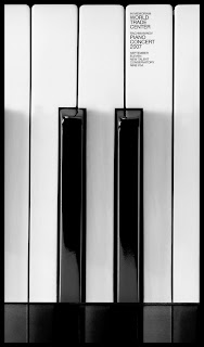

This interesting perspective of the piano is what draws the viewer's eyes into the piece. The sans serif type is very contemporary and simple. The font is very difficult to read in this image, although this design is meant for large posters where the font would be much more legible. I think this idea is very witty...which just goes to show that, as a designer, you must have both a strong sense of humor and intelligence.
Anamorphic Typography
Designer: Joseph Egan
This is student work from the Chelsea College of Art and Design. For Joseph's final project he created this amazing anamorphic type installation. The pieces align properly only when you look at it from a very specific angle. The precision of the type, despite the fact that its stretching across walls and corners, makes this all the more impressive.


This is student work from the Chelsea College of Art and Design. For Joseph's final project he created this amazing anamorphic type installation. The pieces align properly only when you look at it from a very specific angle. The precision of the type, despite the fact that its stretching across walls and corners, makes this all the more impressive.


Wednesday, February 15, 2012
Inspiration!
http://www.thedesignwork.com/18-stop-motion-animation-video-ideas/
The link above displays 18 stop motion animation videos. I used this website for both inspiration and research at how, as a designer, you can take a concept and create one video so many different ways. One of my favorites is We Love 2010. This idea of using letters to spell out a phrase is what I originally wanted to use in my project. Although after watching this, I realized how time consuming it actually is.
The link above displays 18 stop motion animation videos. I used this website for both inspiration and research at how, as a designer, you can take a concept and create one video so many different ways. One of my favorites is We Love 2010. This idea of using letters to spell out a phrase is what I originally wanted to use in my project. Although after watching this, I realized how time consuming it actually is.
Still animation as a music video
The band Fleet Foxes uses still animation as a concept for their music video. It is much more original than just shooting the band in their basement playing. The band begins the video by playing with the title of the song, Mykonos. This is a good idea of introducing the song without putting text at the beginning of the video.
Pierre Michel
This abstract video was created in AfterEffects, a program that I will be learning throughout this course. "Fireflower" is much more complex than anything I will be doing in an intro class, although I still think it is important to see what is out there. Research is key in the conceptual stages of designing. There is so many different effects that can be designed in AfterEffects, most of which I can research for inspiration.
Title Effects

A few days ago, I posted a still animation video using paper as its media of choice. It made an interesting composition, especially with the harsh lighting source in the video. This idea shown in the image above (cutting out stencils in paper) would be cool to shoot.
Avivo

Avivo is an interactive company based in Slovenia. Among services is IT production for next generation multimedia application based on Silverlight, WPF and mobile applications. I like this picture because it shows how you can use multimedia to brand your company and brand your company by using multimedia. These go hand in hand.
Monday, February 13, 2012
Absolut Commercial 2010
Absolut Anthem commercial 2010
A group of artists come together from all around the world to create art pieces that spell out the philosophy of Absolut vodka. What is interesting about this commercial is how you are only shown short cuts of each artist creating there "masterpiece"and it isn't until the end of the commercial that you see them revealed (this is the method the designer used to persuade the viewer to watch the entire commercial). This is a much more artistic approach of marketing liquor than you usually see on television (i.e. Budweiser). The ending shot "In an Absolut World" is not created in AfterEffects with simple text, but rather created and then shot. This is much more interesting and hopefully something I can incorporate into my own project.
Wednesday, February 8, 2012
3D Animation in Commercials
This is a showreel of 3D amination in commercials from all over the world. Most of them are not in English, but the message doesn't matter. What matters to me is the creative design of each one. It is rare when you see a commercial on television that is animated, but when done correctly, it is much more interesting than the typical film commercial. The designers did a fantastic job creating realism while still keeping the commercial fresh and contemporary.
Typography in multimedia


Typography is half of design. I am always finding myself looking at contemporary, crazy fonts that I can incorporate into my own design. The advertisements above are perfect examples of how font can make or break your design. These all add interest to the piece, yet are still legible enough to send the message across. On the other hand, there is a huge difference in typography in advertising and typography in multimedia. I need to be careful when choosing fonts for my videos because they have to be as simple and easy to read as possible. All the fonts above would be ridiculous in multimedia and would turn the viewer away immediately. This is because they would not be able to read it fast enough or could simply give them a headache!
Fading in concepts for Project 1
Monday, February 6, 2012
Still Motion Animation
This still motion animation caught my eye because of the artistic style that was incorporated. This idea of "paper coming alive" is very interesting to watch. And the layering of clips towards the ending scene where everything comes together is what kept me watching the entire video. I also liked the extreme lighting used while shooting, which I could possibily incorporate into my own work (since using a flash on the camera is not possible).
http://www.youtube.com/watch?v=na3pRMYbPyA
http://www.youtube.com/watch?v=na3pRMYbPyA
Sunday, February 5, 2012
SuperBowl Commercial Analysis
The average cost of a 30 second Superbowl commercial is roughly $3.5 million. Even though 100 million people tune into watch the big game, there is still high pressure to design an advertising concept that will grab their attention. Big, international companies such as Coca-Cola, Pepsi and Audi are trying to build on the fact that football fans will already be talking about their commercials on social media. In turn, they hope that when you do this, they (hashtags, scans, shazam, etc.) will organize the response to try and measure it. These hashtags included #GameDayPolarBears and #SoLongVampires during the first and second quarter. Today, social media is a key part in advertising and SuperBowl XLVI is the perfect example of this. It is importatnt that I consider this in my own design work and the work I create in the future.
 |
| Audi Commercial |
Subscribe to:
Posts (Atom)