
Wednesday, May 2, 2012
Dying Arts
As Kindles, iPads and Nooks become the technology of the future, books are becoming, in a sense, a lost art. It is only natural for things to come and go, but designers have to constantly adjust for these developments. Simple materials, such as record covers and bookmarks, are a thing of the past. Although I still enjoy finding designs based around these products. Below is an illustration design on a bookmark that caught my eye.

Inside/Back CD Design

The top image will be the right inside of my CD. This will have the actual CD on top of it (covering up the yellow stripes). Then when the person takes the CD out of the case, they will notice the touch of yellow from the front and back of the case. This both adds interest and keeps consistency throughout my design.
The bottom image is the back of my CD. I repeated both the carroll logo and contact info so the viewer will be able to see the information no matter which side it is layed on a surface (desk or whatever). I continued the design from the front onto the back, creating a wrap around.
Cover Design

This is the cover design for Project 4 that I am working on. I basically have two styles that I am meshing together (large, graphic yellow stripes jagged against a dark grey background & smaller light toned gray stripes to created textured background), both of with come from the concept I developed in my Interactive Kiosk. Besides the carroll logo and contact information, I wanted to keep the front very simply to emphasize the title of the cd, Scott Center. I placed a small introduction paragraph underneath the directions. I did this because the reader is more likely to actually read through if it is underneath other important information...as opposed to placing it on the back of the cd and the person never look at it.
CD Design

CD Layout Design

Environmental Art
When it comes to fine art, sculpture has always been a weakness of mine. This is why I can truly appreciate and respect it as an artform. Below is a piece of work from an art institute student's senior showcase. I love the artist's interpretation of what many believe to be as simply junk sitting in the center of the room. The concept of creating a composition not only in the piece but also interacting with the environment around it, is what makes this sculpture go beyond other abstract art I have seen.
Wednesday, April 25, 2012
CD Design Layout

Friday, April 20, 2012
Webpage Design
I ran into this design layout for Glass Coat, a photo booth company. What makes this so successful as a design is the simplicity and organization of the layout. The orange accents work seamlessly with the black and white photography. My favorite part of this is the unique placement of the social networking tabs by the footer.
Wednesday, April 18, 2012
Bleeds and Wrap Arounds

It is common for designers to wrap around large images or graphics from front to back. This adds continuity to a piece of work and is much more interesting than simple backgrounds. For my project, I would like to incorporate the gray stripes from my interactive kiosk onto my cd layout.
Arranging Type on CD

The purpose of the back and inside sleeves are to hold the bulk of the information. Although it is important to put type on the CD as well (Title, Contact, etc.) just in case the person loses the case and only has the CD on them. The image above is an excellent example of how much type to arrange on the CD and where the correct placement is. This designer incorporated the design element from the cover and added a title in the bottom right corner of the disk (where there is dead space in the design).
Wednesday, April 11, 2012
Wine & Spirits
I have always been incredibly inspired by product packaging and branding on wine and alcoholic beverages. Below are some of my favorite designs that I found across Pinterest.

 |
| Heineken |

 |
| Stranger and Stranger Christmas Absinthe Limited Edition Bottle |
 |
| Shefa Wine |
Pentawards
The Pentawards are the first and only worldwide competition exclusively devoted to packaging design.
Below are some of the winners from last year competition that gave me a little inspiration.
I think it is critical that new designers like myself research these types of competitions in the graphic design field. Knowledge is power, and I think seeing what other designers are working on with, in turn, reflect in my personal work.


Package Design
Product packaging design is all too often ignored in the commercial world, which means when a product is packaged creatively, it stands out. As products sitting on store shelves cry out for attention, it's the product design that can mean the difference between what gets bought and what gets left behind. Below are a few product designs that stood out to me.
 |
| Five Organic Olive Oil | Simplistic! The black and white color scheme draws emphasis on the wood cork, which ties in with the branding concept of an all organic product |
 |
| Babees Honey |
 |
| Key Cola | Incoporating the classic designs of soda companies and mixing it with the contemporary designs of the oh so popular energy drinks |
 |
| Saxton Cider | Love how the color scheme in the labels compliment the color of the cider! |
 |
| Dearly Beloved |
BMW M3 Advertising
Ad agency, Serviceplan Munich, were given a brief by BMW Germany to produce a special billboard at Hamburg airport featuring the M3 Coupe, a 50 x 2m light wall in the middle of the arrivals hall.
They came up with the clever idea to use the reflective surface of the floor to extend their canvas, creating the headline out of half-letters and using the shiny floor to convey the message ‘Exceed Maximum’. The campaign picked up a Silver in the latest Epica Awards for creativity in film and media.


Microsoft Surfaces
Microsoft has designed their version of an interactive kiosk, but with a little tweak. Rather than having the kiosk displayed like a TV or computer (most likely hung on the wall), Microsoft has designed the screen into a hands on table. Most of the images below are examples of how business' such as casinos and cell phone companies plan on using this invention to better their company. The possibilities are endless for this major breakthrough. This pushes the idea of the world becoming completely virtual to a whole new level.
 |
| Caesars Palace incorporating the tablets into gambling games, such as the simple Scratch and Win. |
 |
| T-Mobile has the tablet sensing the cell phone and comparing the data with other data. |
 |
| Scanning credit cards without a machine...and even able to add tip with your fingers! |
 |
| Casinos are the most likely to incorporate this invention into their business' because they have the budget to spend on these types of technology. |
Automobile Touchscreens
Touchscreen GPS in cars have been around for many years now. Although these touch screens are now multi-purpose. They are now much larger than when they were first designed. This opens up possibilities for designers because they have a larger area to design and they can be more creative with these designs. Now an automobile touchscreen can display the weather, GPS, music stations, direction, and even your gas tank levels.


Microwave Oven Touchscreen
With technology booming, designers have to constantly be on their toes for the next "contemporary" idea. GUIFX took the idea of a touchscreen microwave and made it a reality. Touchscreen appliances are becoming more popular and are considered the standard in new, industrialized homes. As a designer, this opens up numerous doors to experiment with interactive screen layouts.


Mammoth Mountain 3D
Below are some images of the 3D interface of Mammoth Mountain. The designer chose to place the navigation at the bottom left so it wouldn't distract from the main concept of the layout (the 3D mountain animation).


Pearson Airport
Below are some images from the Pearson Airport's Interactive Kiosk.
This Passage Oublie is an interactive, touch screen kiosk video. The designer took the approach of creating a large interactive map of the world, which compliments is purpose and audience nicely.


This Passage Oublie is an interactive, touch screen kiosk video. The designer took the approach of creating a large interactive map of the world, which compliments is purpose and audience nicely.


Monday, March 19, 2012
Kiosk Layout
 |
| Kansas City layout: this kiosk is very image heavy with the navigation at the bottom. The images transition as you move from decade to decade. |
 |
| This kiosk is centered around Sony's cell phone design. The concept to this layout is puzzle pieces that come together to form the cell phone. Movement is key in this design, with all the cell phones "floating." |
Kiosk Layout Design: Psychedelic '60s

Kiosk layout design is similar to web design, although kiosk design opens up freedom to experiment with motion, non-grid based designs, and interactivity. The design above has the navigation at the bottom of the kiosk screen and focuses on hand drawn lettering. Images can be much larger and have a higher resolution than those on the web. This opens up freedom to be more creative with image editing and photo manipulation.
Wednesday, March 14, 2012
Text and Logo Placement in Videos
Placement in graphic design is not only important, but it can drastically change the mood and feeling of the piece. Bad text and/or image placement can easily make a body of work go from sophisticated to elementary. I struggled a little with this in Project one.
Some criticism that was said:
- correct the color of Carroll logo from blue to white (to contrast more against the black background)
- change the type so it follows typography heirarchy (italics, size, bold, etc.)
- re-arrange the "Scott Center" and Carroll logo placement
In doing these changes, it turned Project 2 into a much more sophisticated promo video. It can be difficult to place text in a video because you are not necessarily working with a blank canvas, but rather an image with color, contrast, and values. This can make it harder for the viewer to read the text and/or logo. It is our job as the designer to create solutions to this. I chose more of a "cop-out" solution in that I placed my text against a black background, although I did this to match the asthetics of my video. Although, if I needed to add information against an image, then I would need to place the text in an area that does not have much interest (in either black or white...NO COLOR).
Monday, March 12, 2012
Honda Commercial 2008
Honda did not create their own music for this commerical, but rather choose a song by The Fray and added sound effects to their audio. This can be very effective as long as the song conveys the mood of the commercial without being too trendy or disruptive. A lot of people relate a song to a certain time period or feeling, which makes it tricky for company's to choose a proper song for a commercial. In this case, "How to Save a Life" works well.
Invisible Mercedes Commercial
The audio in this Mercedes commercial is very simple (in that it does not have too many different instruments incorporated) which shows the sophistication and luxury of the commerical. It has a hint of techno and other electronic sounds to reinforce that this is "the technology of the future."
The Future of Magazines...
Living Magazine Cover and Spread | Outside Magazine
This could possible be the future of publication design. More and more magazines are incorporating these ideas of "interactive spreads" and "living covers." From now on, magazine designers will be directly working with videographers and multimedia designers to publish these types of publications.
Marc Swanson
Contemporary artist | Black Glitter


I have seen this use of line work incoporated into graphic design on multiple occasions. It is a strong way to bring the viewers eyes into a piece of work and direct it throughout the design. Black Glitter is very different than most of his other artwork because this piece was more design-oriented.
Product Design
Graphic design is a creative process. It does not limit you to one program or one method. Environmental and product design is a huge industry. I have never really considered going into this field in graphic design, although I do respect the process. Below are some designs I found on Pinterest that I found are breakthroughs in product design.
 |
| Joseph Joseph New Nest 9 Plus. Space saving and convenient. |
 |
| book hammock |
Fab Ciraolo
http://fabianciraolo.blogspot.com/
Above is a link to his design blog. Fab Ciraolo is an illustration artist that designs flyers, cd covers, and other pop culture based illustrations. He is the perfect example of an artist exploring their own personal illustration style.

Above is a link to his design blog. Fab Ciraolo is an illustration artist that designs flyers, cd covers, and other pop culture based illustrations. He is the perfect example of an artist exploring their own personal illustration style.

Monday, February 27, 2012
Skittles Stop Motion
too bad the audio sucks.
Audi A4 Commercial Audio
"Progress is beautiful"
This audio is more of what I am striving for in my own project. This commercial beings with just a simple piano tune, followed by strings and then drums. I like the layering of instruments leading up to a powerful ending. I think this is an effective use of audio for my project because it adds on to my concept (of progressing from a blank canvas to a painting).
This audio is more of what I am striving for in my own project. This commercial beings with just a simple piano tune, followed by strings and then drums. I like the layering of instruments leading up to a powerful ending. I think this is an effective use of audio for my project because it adds on to my concept (of progressing from a blank canvas to a painting).
Nike Commercial Audio
The audio for Nike commercial is very aesthetically pleasing to the general population overall. There is nothing original about this piece, although I do this it works well with the commercial. They released this commercial for the 2002 Winter Olympics. The contrast between the soft, feminine music (piano and violins) with the raw, masculine sport activities (running and sweating) is what gives this commercial interest.
Monday, February 20, 2012
Poster design by Ziad Alkadri
Designer: Ziad Alkadri
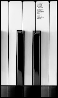

This interesting perspective of the piano is what draws the viewer's eyes into the piece. The sans serif type is very contemporary and simple. The font is very difficult to read in this image, although this design is meant for large posters where the font would be much more legible. I think this idea is very witty...which just goes to show that, as a designer, you must have both a strong sense of humor and intelligence.
Anamorphic Typography
Designer: Joseph Egan
This is student work from the Chelsea College of Art and Design. For Joseph's final project he created this amazing anamorphic type installation. The pieces align properly only when you look at it from a very specific angle. The precision of the type, despite the fact that its stretching across walls and corners, makes this all the more impressive.


This is student work from the Chelsea College of Art and Design. For Joseph's final project he created this amazing anamorphic type installation. The pieces align properly only when you look at it from a very specific angle. The precision of the type, despite the fact that its stretching across walls and corners, makes this all the more impressive.


Wednesday, February 15, 2012
Inspiration!
http://www.thedesignwork.com/18-stop-motion-animation-video-ideas/
The link above displays 18 stop motion animation videos. I used this website for both inspiration and research at how, as a designer, you can take a concept and create one video so many different ways. One of my favorites is We Love 2010. This idea of using letters to spell out a phrase is what I originally wanted to use in my project. Although after watching this, I realized how time consuming it actually is.
The link above displays 18 stop motion animation videos. I used this website for both inspiration and research at how, as a designer, you can take a concept and create one video so many different ways. One of my favorites is We Love 2010. This idea of using letters to spell out a phrase is what I originally wanted to use in my project. Although after watching this, I realized how time consuming it actually is.
Still animation as a music video
The band Fleet Foxes uses still animation as a concept for their music video. It is much more original than just shooting the band in their basement playing. The band begins the video by playing with the title of the song, Mykonos. This is a good idea of introducing the song without putting text at the beginning of the video.
Pierre Michel
This abstract video was created in AfterEffects, a program that I will be learning throughout this course. "Fireflower" is much more complex than anything I will be doing in an intro class, although I still think it is important to see what is out there. Research is key in the conceptual stages of designing. There is so many different effects that can be designed in AfterEffects, most of which I can research for inspiration.
Title Effects

A few days ago, I posted a still animation video using paper as its media of choice. It made an interesting composition, especially with the harsh lighting source in the video. This idea shown in the image above (cutting out stencils in paper) would be cool to shoot.
Avivo

Avivo is an interactive company based in Slovenia. Among services is IT production for next generation multimedia application based on Silverlight, WPF and mobile applications. I like this picture because it shows how you can use multimedia to brand your company and brand your company by using multimedia. These go hand in hand.
Monday, February 13, 2012
Absolut Commercial 2010
Absolut Anthem commercial 2010
A group of artists come together from all around the world to create art pieces that spell out the philosophy of Absolut vodka. What is interesting about this commercial is how you are only shown short cuts of each artist creating there "masterpiece"and it isn't until the end of the commercial that you see them revealed (this is the method the designer used to persuade the viewer to watch the entire commercial). This is a much more artistic approach of marketing liquor than you usually see on television (i.e. Budweiser). The ending shot "In an Absolut World" is not created in AfterEffects with simple text, but rather created and then shot. This is much more interesting and hopefully something I can incorporate into my own project.
Wednesday, February 8, 2012
3D Animation in Commercials
This is a showreel of 3D amination in commercials from all over the world. Most of them are not in English, but the message doesn't matter. What matters to me is the creative design of each one. It is rare when you see a commercial on television that is animated, but when done correctly, it is much more interesting than the typical film commercial. The designers did a fantastic job creating realism while still keeping the commercial fresh and contemporary.
Typography in multimedia


Typography is half of design. I am always finding myself looking at contemporary, crazy fonts that I can incorporate into my own design. The advertisements above are perfect examples of how font can make or break your design. These all add interest to the piece, yet are still legible enough to send the message across. On the other hand, there is a huge difference in typography in advertising and typography in multimedia. I need to be careful when choosing fonts for my videos because they have to be as simple and easy to read as possible. All the fonts above would be ridiculous in multimedia and would turn the viewer away immediately. This is because they would not be able to read it fast enough or could simply give them a headache!
Subscribe to:
Posts (Atom)