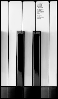
This interesting perspective of the piano is what draws the viewer's eyes into the piece. The sans serif type is very contemporary and simple. The font is very difficult to read in this image, although this design is meant for large posters where the font would be much more legible. I think this idea is very witty...which just goes to show that, as a designer, you must have both a strong sense of humor and intelligence.

No comments:
Post a Comment